
The decision in one line
Choose the content hierarchy before choosing image ratios. Clear priorities, independently readable images, and a deliberate upload order remain effective even when Facebook changes the preview.
A Facebook multi-image post is more than a group of attractive pictures. The number of images, their proportions, and the role of the first image determine what people notice first and whether they understand the story. A good layout can clarify product features, event highlights, tutorials, or case-study evidence; a weak one creates several competing focal points.
SPOTMIND takeaway: choose the content hierarchy before choosing image ratios. The platform may change the preview, but clear priorities, independently readable images, and a deliberate upload order remain effective.
This guide turns common Facebook multi-image displays into practical content frameworks. Treat them as layout patterns, not permanent official specifications. Meta confirms that some users may see layout choices when uploading multiple photos, while the actual result can vary by device, app version, account, and product update. Always inspect the real publishing preview before posting.
Choose the image count by content purpose
- 1 image: one focus, one claim, or one hero visual.
- 2 images: a comparison, before and after, two angles, or two equal ideas.
- 3 images: one hero supported by two pieces of evidence or detail.
- 4 images: one hero plus three points, or four equal items.
- 5 images: a complete narrative, portfolio, product range, or tutorial.
- Interactive layouts: a hero attracts attention before the remaining content is expanded.
- Mobile layouts: columns, banners, or frames create rhythm in a narrow feed.
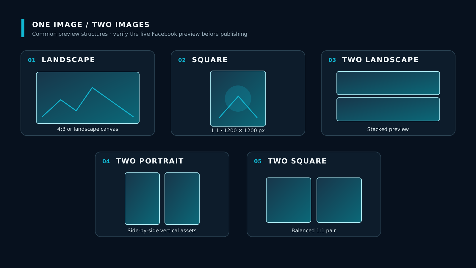
One image: make one message complete
A single image suits a post with one central message. With no supporting images, the visual must both stop the scroll and explain the topic.
Use a landscape image for scenes, events, teams, spaces, or side-by-side comparisons. A 4:3 canvas such as 1200 × 900 px is a practical starting point. Use a square image for products, people, key statements, or content that will be reused across platforms; 1200 × 1200 px is easy to manage.
Keep key text, faces, and products away from the edges. Thumbnails and different screen widths may still change what remains visible.
Two images: create meaning through a relationship
Two images work when the viewer can quickly understand why the pair belongs together.
- Two landscapes stacked: process stages, two moments, or context followed by result.
- Two portraits side by side: people, full-length products, front and back, or two angles.
- Two balanced squares: equal options, features, or a Before / After comparison.
If one image matters more, do not force perfect symmetry. Put the hero first and use composition, gaze, or headings to guide attention to the second image.
Three images: one theme, two supporting points
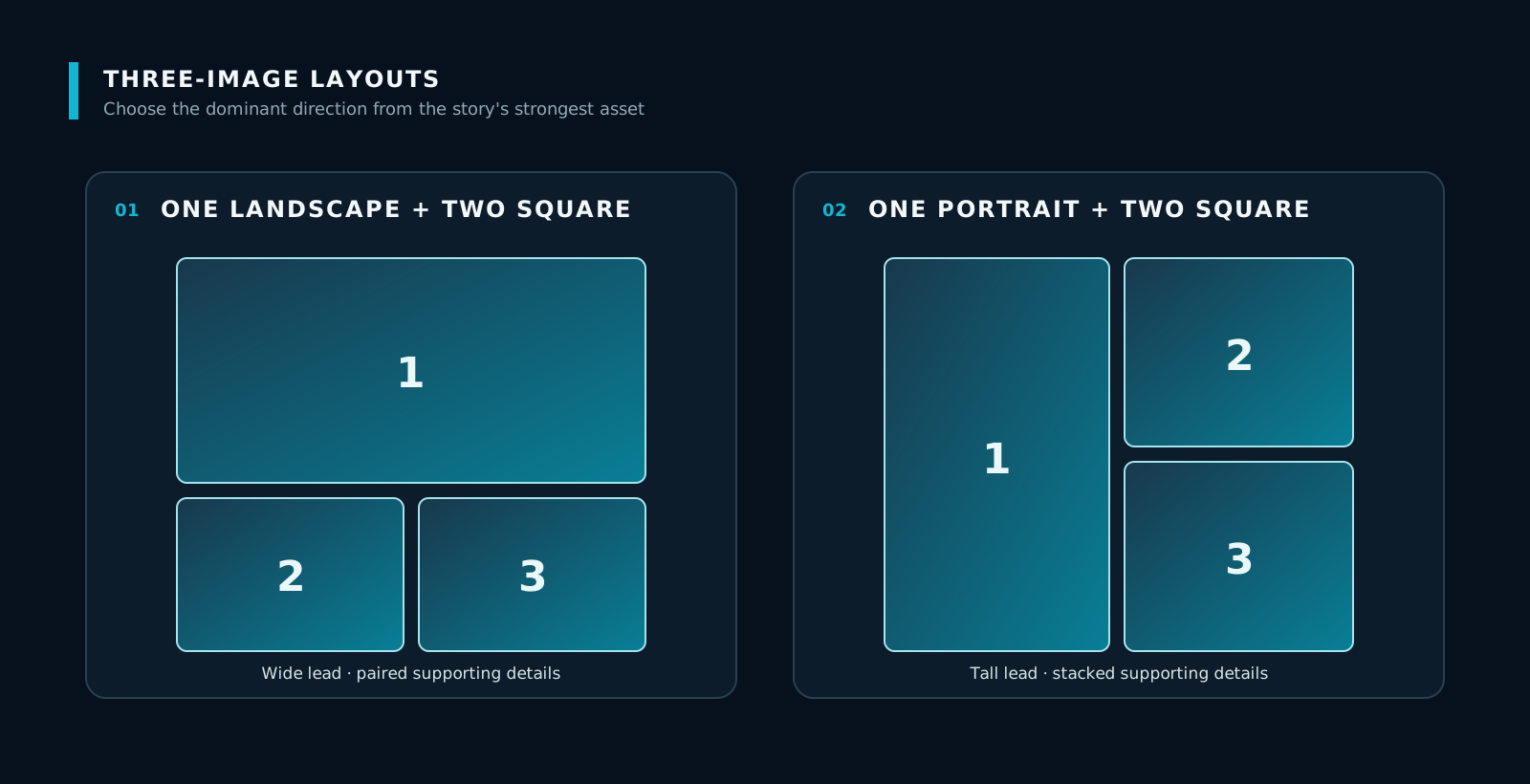
The clearest three-image structure is one hero plus two supporting images.
- One landscape hero + two squares: establish the overall scene, then reveal two details.
- One portrait hero + two squares: centre a person, product, or poster, then add proof, features, or outcomes.
Build the sequence as “claim → evidence one → evidence two” or “overview → detail → action.” Without that relationship, the post becomes three competing focal points.
Four images: choose one-plus-three or four equals
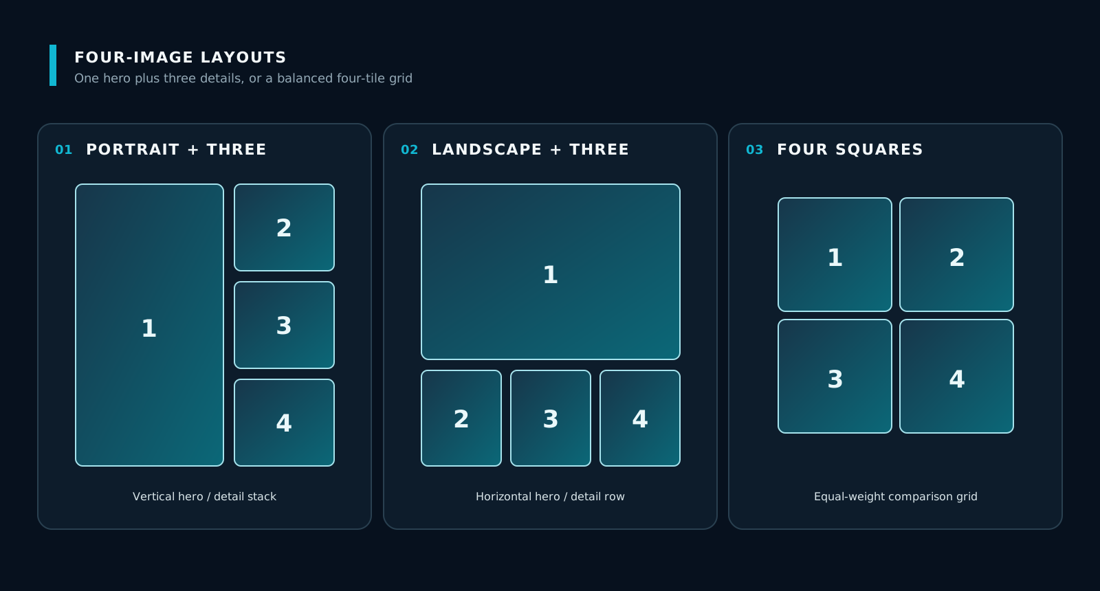
Four images create enough space for hierarchy, but can also feel flat if everything receives equal emphasis. Decide whether the content has a clear hero.
- Portrait hero + three supporting images: a person, product, or campaign visual supported by three selling points.
- Landscape hero + three supporting images: an event, case overview, or space supported by three details.
- Four squares: four equal steps, services, works, or products.
In a one-plus-three layout, the hero should explain what the set is about and each smaller image should answer one specific question. With four equal squares, consistent headings, numbering, and spacing matter more than decoration.
Five images: divide a complete story into five jobs
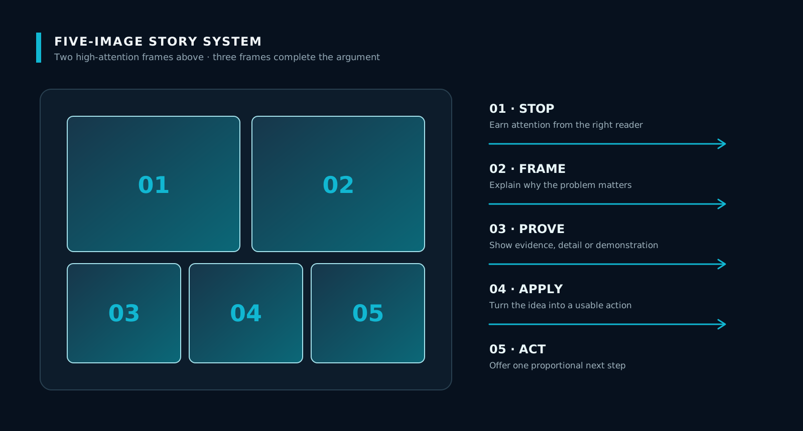
Five square images suit portfolios, product ranges, event recaps, and educational content. Classic previews often give the first two images more visual weight, so place the most important topic and proof early while keeping every image independently readable.
SPOTMIND recommends this five-step content path:
- Stop: use a specific question, outcome, or tension to attract the right reader.
- Frame: establish the context and explain why the problem matters.
- Prove: show product detail, process, data, a case example, or observable evidence.
- Apply: turn the idea into a checklist, steps, or an immediately usable method.
- Act: offer one next step—save, share, read the full article, or enquire.
A five-image post should not be one large poster sliced into tiles. If the platform changes the crop or order, any sentence that depends on the neighbouring image may fail.
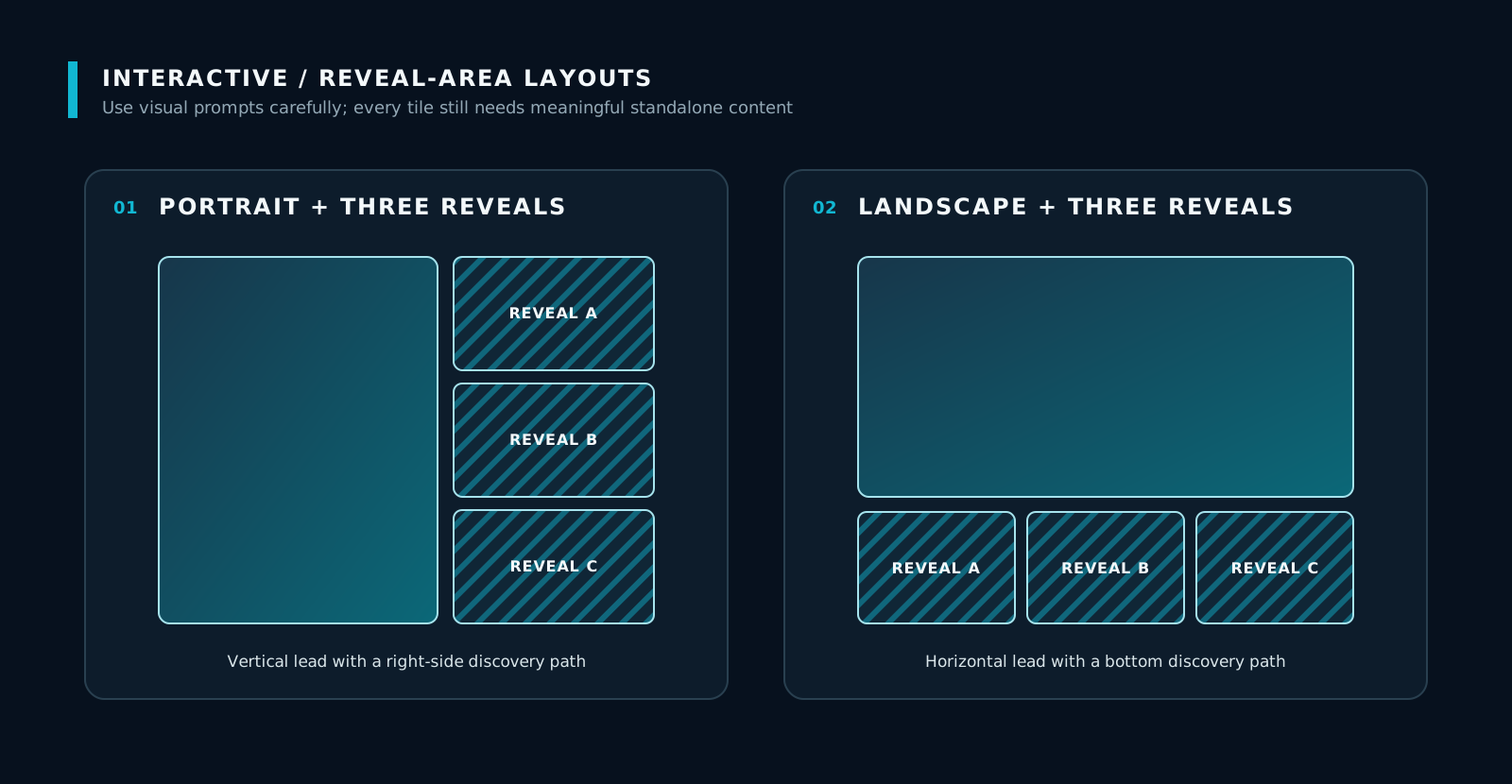
Interactive or reveal layouts: attract, then fulfil
Some multi-image displays use a large portrait or landscape hero with three smaller images, suggesting that more content is available to expand. This structure suits reveals, step-by-step stories, transformations, event recaps, or product ranges.
It is not a permanently guaranteed “unlock” feature. Avoid fake buttons, false notifications, or claims that clicking will always create a particular effect. The hero should provide genuine value, while the expanded images fulfil its content promise.
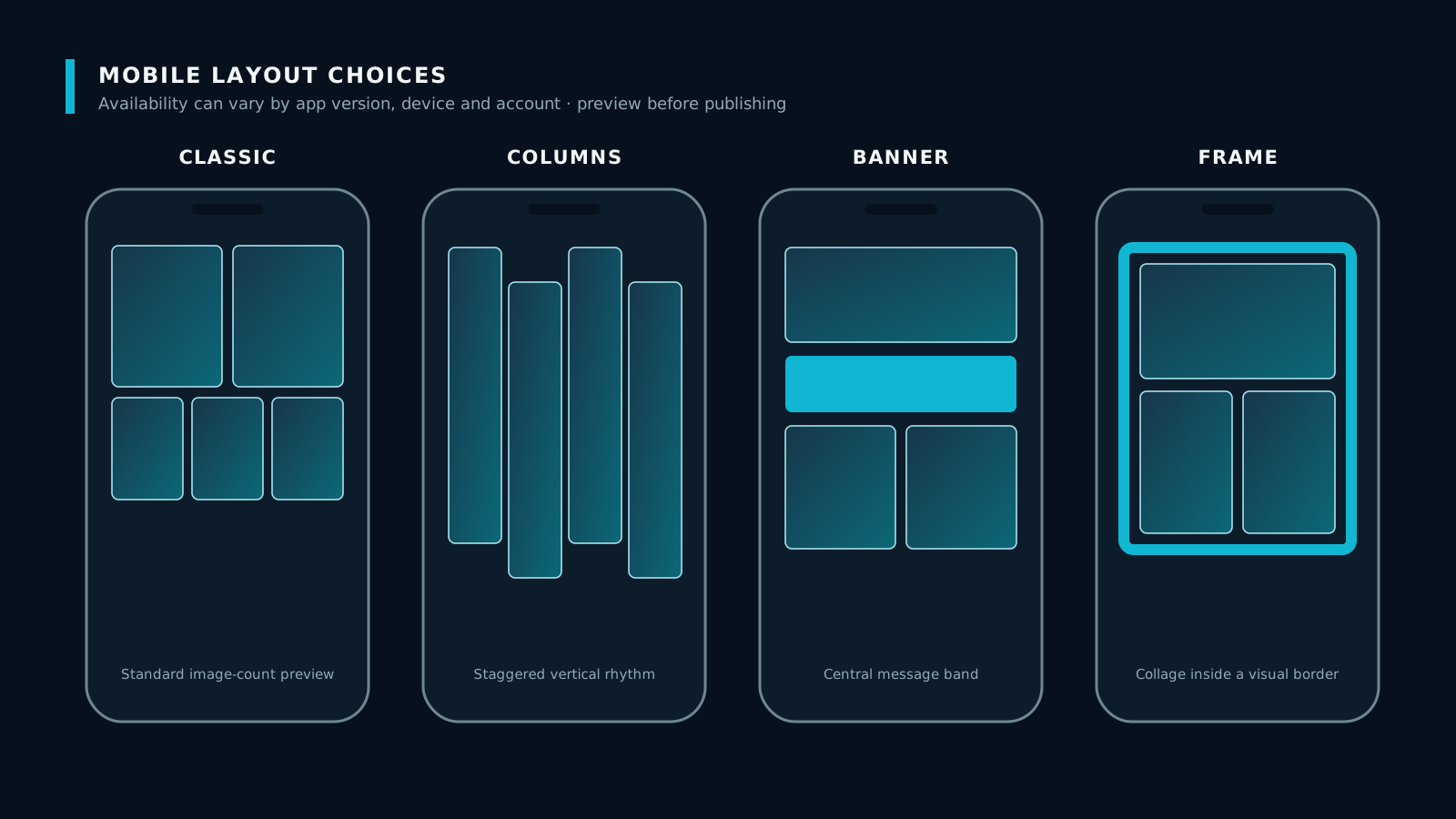
Mobile layouts: Classic, Columns, Banner, and Frame
Some mobile publishing interfaces may offer different layout styles. Think of them as four reading rhythms:
- Classic: a familiar photo grid for general event, product, or lifestyle content.
- Columns: vertical lanes for portraits, fashion, products, or sequential scenes.
- Banner: a wide hero leads the set, suitable for events, spaces, scenes, or landscape visuals.
- Frame: a collage-like treatment for atmosphere, recaps, and lifestyle stories.
These options will not necessarily appear for every account or upload. Prepare assets around the content need first, then review what is available in the real account.
Five principles that apply to every layout
- Keep ratios consistent within a set. If ratios must be mixed, define the hero and supporting images deliberately.
- Leave a safe area around critical content. Keeping text, logos, faces, and products about 10% from the edge reduces cropping risk.
- Make every image understandable on its own. A saved or shared image should retain its meaning.
- Use filenames to lock the narrative order. Names such as `01-hook`, `02-context`, and `03-proof` make uploading easier to verify.
- Retain high-resolution masters. Platforms reprocess images, and originals make later exports easier.
Pre-publish checklist
- Does each image have one main message?
- Can the first image explain the topic at thumbnail size?
- Does the upload order match the written narrative?
- Are critical text and subjects away from the edges?
- Do mobile and desktop previews preserve the important content?
- Is the alt text accurate rather than a repetition of the headline?
- Is there only one clear call to action?
- Are all data and performance claims supported?
Measure according to the content objective
- Education: saves, shares, substantive comments, and full-article clicks.
- Brand or portfolio: photo views, profile visits, and website visits.
- Product or service consideration: qualified enquiries, landing-page views, and follow-up actions.
- Events: event-page clicks, registration intent, and post-event enquiries.
Layout alone does not guarantee reach or conversion. Its job is to reduce the effort needed to understand the topic, proof, and next step. When testing, change one major variable at a time—such as the cover, order, or CTA—so the result remains interpretable.
Conclusion: no single layout is always best
One image suits a single focus, two images suit relationships and comparisons, three or four images create hierarchy, and five images support a complete narrative. Interactive and mobile layouts offer additional reading rhythms.
Three principles remain useful across platform changes: clear hierarchy, independently readable images, and a real preview before publishing. If those are in place, the content is less likely to lose meaning when Facebook changes its display.